A Small Rant
I use maps a lot; both the "old-school" paper maps (such as Ordnance Survey), as well as online and digital maps (Google Maps, Ride with GPS, Map my Ride, to name a few). I like maps and enjoy using them. As a full-time cyclist; I need and rely upon good maps. From my experience in graphic design and over 40 years of cycle touring; I have a pretty solid understanding of what works well with maps — and what doesn't.
The sign boards/maps created and installed by Torfaen County Burough are a nightmare. Yes, they appear attractive and give the impression of sophistication with their highly stylised (and most probably), very expensive housing. But to anyone not familiar with the area, they are completely useless. They give no clear understanding of distances, terrain, and what is most shocking — not even a clear sense of direction! That's right. There is no compass indicating north, south, east or west.
But they confuse us even further by inverting the map from one side to the next so that locations appear differently. Unless you already know which way you're going and then understand which side corresponds to that direction - these maps are completely confusing. Rule no# 1. Maps should make things clear.
In the map above (fig. 1), it seems that the creator of these maps thinks people should just understand that they are traveling from the bottom of the map to the top, regardless of which side they are facing. But who does that? North is always at the top of maps - that is how maps have been made for centuries. Understanding this is the primary consideration when viewing a map. Why would you ever put north at the bottom?
Secondly, no one would expect the information to differ from one side to the next. Just glancing at these sign boards, most people would assume that the two panels present the same information twice for conveniece.... so that multiple people can view it at once. Who makes one sign board with two different maps of the same places? That's just confusing.
In the second image (fig. 2), I wonder why do I have to sort out the distances between locations from a legend? There are really only four distances to be considered. Why do I have to go back and forth to understand these important numbers? Why not have them right along the map itself? (There's plenty of room.) Would that not have made reading the map simpler? Would that not have been more clear?
By the way, I have no idea what the "c"'s and "g"'s listed with the location numerals indicate. There's no explanation, but I can tell that I'm at 1c. (Where is 1a & 1b?) Regardless, my next junction appears to be 2c.
And what's going on with the scale? Why are the longer distances shown with shorter lines? (fig. 2 & 3) This leaves the user wondering if the lines are wrong or if the distances indicated are incorrect. Rule no# 2. Maps should show the relative distance between locations and provide an accurate sense of scale.
The next area of concern is about the graphical format. This linear style of map is generally intended for mass transit, where the primary concerns are for quickly reading the stops along the route and the order in which those stops occur. Navigation of the route itself is not important. These maps are designed to be simple, clear and easy to read from a distance.
Using this style of map for walking and cycling over-simplifies all of the important navigational details that walkers and cyclists need. Because walkers and cyclists are having to carry the burdon of travel themselves, ie, make turns, climb hills, navigate junctions, and measure distances — those features are critical. This is simply an ineffective visual language which only provides information to those familar with the area and ironically, if you are familiar with the area, you don't need this information.
But setting the design aesthetic aside, the worst feature is that these maps mislead us by presenting the information incorrectly. For example; in fig. 5 below, it shows that the user must turn left at junction 3c to continue along route 49. It also shows that route 49 will simply merge into route 492 at junction 3c. It appears quite simple and straight-forward. This; however, is completely wrong.
In truth, the user does not need to turn left at junction 3c to continue on route 49 (as shown in fig. 5). Route 49 continues straight along the canal uninterrupted as shown below in fig. 6.
However, in order to reach route 492 (fig. 6), the user must turn right at junction 3c, then navigate a complex series of roads, pavements, and roundabouts. Why is this critical information disregarded? It is nothing like what the simplified version shows. No one could even guess that these two maps represent the same area and junction(s). Rule no# 3. Maps should be up-to-date, accurate, and reliable.
The remainder of the information on the sign board/map is completely superfluous. I have no idea how to get to any of the locations indicated with the green lines? (I will need a map for that!) And what about the train station in Cwmbran? Is that not relevant information to offer walkers and cyclists?
If you noticed, there's also a National Cycle Network sign standing just behind the fancy map. One route — two distance markers. I think the two organisations should have worked together here, don't you? This would never happen along a roadway. Read more...
I wonder if the people that designed and created these sign board/maps have ever used them? Have they ever used maps at all? How many of these sign board/maps are there in the county? What was the exspense paid by the tax payers for these stylish, yet ineffective bits of decoration? And finally, let's hope that these do not become a standard by which sign board/maps are created throughout the surrounding counties.
The sign boards/maps created and installed by Torfaen County Burough are a nightmare. Yes, they appear attractive and give the impression of sophistication with their highly stylised (and most probably), very expensive housing. But to anyone not familiar with the area, they are completely useless. They give no clear understanding of distances, terrain, and what is most shocking — not even a clear sense of direction! That's right. There is no compass indicating north, south, east or west.
But they confuse us even further by inverting the map from one side to the next so that locations appear differently. Unless you already know which way you're going and then understand which side corresponds to that direction - these maps are completely confusing. Rule no# 1. Maps should make things clear.
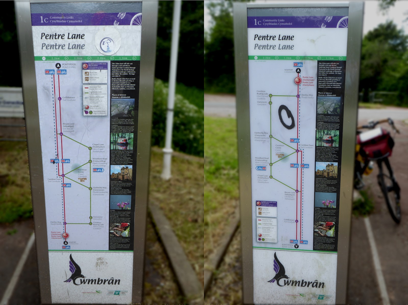 |
| fig.1 - Why is there no compass and why is north at the bottom on one side? |
Secondly, no one would expect the information to differ from one side to the next. Just glancing at these sign boards, most people would assume that the two panels present the same information twice for conveniece.... so that multiple people can view it at once. Who makes one sign board with two different maps of the same places? That's just confusing.
 |
| fig.2 - Why do we need a legend and why not put those distances between the locations? |
By the way, I have no idea what the "c"'s and "g"'s listed with the location numerals indicate. There's no explanation, but I can tell that I'm at 1c. (Where is 1a & 1b?) Regardless, my next junction appears to be 2c.
And what's going on with the scale? Why are the longer distances shown with shorter lines? (fig. 2 & 3) This leaves the user wondering if the lines are wrong or if the distances indicated are incorrect. Rule no# 2. Maps should show the relative distance between locations and provide an accurate sense of scale.
 |
| fig.4 - Why is there no sense of scale? Why do the longer distances have shorter lines? |
Using this style of map for walking and cycling over-simplifies all of the important navigational details that walkers and cyclists need. Because walkers and cyclists are having to carry the burdon of travel themselves, ie, make turns, climb hills, navigate junctions, and measure distances — those features are critical. This is simply an ineffective visual language which only provides information to those familar with the area and ironically, if you are familiar with the area, you don't need this information.
But setting the design aesthetic aside, the worst feature is that these maps mislead us by presenting the information incorrectly. For example; in fig. 5 below, it shows that the user must turn left at junction 3c to continue along route 49. It also shows that route 49 will simply merge into route 492 at junction 3c. It appears quite simple and straight-forward. This; however, is completely wrong.
 |
| fig.5 - Not only does this over-simplify the junction with Route(s) 49 & 492, it is shown incorrectly. |
 |
| fig.6 - This map shows what a traveler will actually encounter. |
The remainder of the information on the sign board/map is completely superfluous. I have no idea how to get to any of the locations indicated with the green lines? (I will need a map for that!) And what about the train station in Cwmbran? Is that not relevant information to offer walkers and cyclists?
If you noticed, there's also a National Cycle Network sign standing just behind the fancy map. One route — two distance markers. I think the two organisations should have worked together here, don't you? This would never happen along a roadway. Read more...
 |
| fig.7 - One more bit of confusion... hey Sustrans!, are those miles or kilometers? |